Digging deep to take a redesign project further
Discovery, Design Research, and Field Research
5 - 7 weeks || Interviews, Competitive Analyses, JTBD || Lead Researcher
THE PROBLEM:
A rebrand project reveals deeper concerns from customer experience to competitive pressures. Can we leverage a redesign to bring change to product and brand strategy?


Background
Our client, a large irrigation manufacturer, approached us requesting a responsive mobile-friendly site since theirs hadn't been updated for 2 decades. In our push for a sincere discovery phase, we learned several concerns riddling our client’s business, that they felt were completely out of their control given the industry's atypical sales model.
Our challenge was to balance a user centered approach alongside creating a site as an intervention for prospective customers given that our client being a manufacturer rather than a dealer. To go beyond the surface, we needed to understand the brand and get into industry specific details, preserve relevant content, and come up with some creative solutions.
We were tasked with
modernizing and making the site responsive
Add some flair to their brand voice, since their current experience had none.
Approach
We needed to accomplish a few key things:
Rework Information design and architecture:
In 'starting from zero', we needed to fully understand what we were working with before we tore it down and reorganized it.Understand our user base: While this seems fairly obvious, we needed to prioritize this as we were working in an unfamiliar industry with several intermediaries and it would inform every part of our redesign process.
Look underneath: The key thing we were tasked with for this project was to simply make their site responsive and mobile friendly. However, we understood early that we would be solving usability issues our client didn't even know they had.
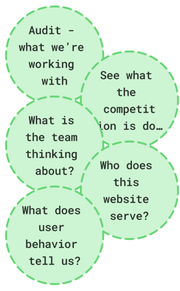
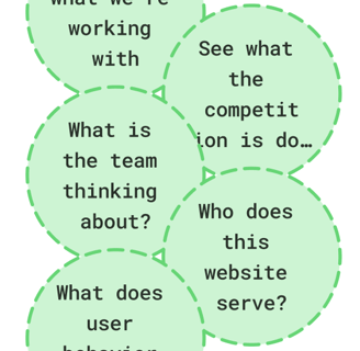
Our team (Myself, a UX designer, and a UI designer) decided to take inventory of the site’s pages and their product content, undertaking a brief UX audit of the site.
We also undertook a competitive analysis to understand other companies in the landscape, and our designer did an additional competitor design audit.
I undertook 12 Stakeholder (and user) Interviews targeted at company executives, farmers/growers, and dealers.
We synthesized those findings into “Jobs to be done”, to build a comprehensive set of user needs and see how to cater to multiple groups.
You can read a bit more about the methodology vis a vis personas in an NN/g article here.We designed card sorts and surveys to send out within the company and to customers, but ultimately restricted them to internal teams due to time constraints.
I followed that up with Web Analytics reviews once the design process had begun to get an insight into user behavior, popular pages, and queries etc.
So what did we do...
All this discovery led us to come up with a plan based on what we learned,
Knowing the basics the industry worked, cataloging and organizing their detailed product line, and hearing the issues their customers faced - we could build the functions the site needed to serve.
Learning the client’s brand value and company’s values, what motivates growers and dealers to buy from the client - we developed a voice for how we could talk about them.
Digging into user and stakeholder needs told us what new features and concerns we needed to account for.
(responsiveness, while important- wasn't that high on the list)
How do we design this thing?
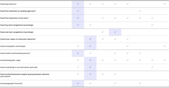
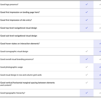
Key Findings:
There are SO many products. The navigation had to be decluttered, hierarchies needed to be clear to avoid information overload.
Visually the brand needed to be uplifted. Good photography is key and while our client had good product and environmental photographs, they weren’t blending into the page and adding to the overall impression.
Given several site usability issues, we couldn't rely too heavily on analytics but there were still insights to be gleaned from drop off and navigation patterns.
Our interviews confirmed even “power” users had a tough time finding content and relied heavily on the “site search” which had its own issues.
There are lots of fingers in this pie - but our JTBD framework was helpful to get us started, collapsing users into defined categories.
This was a company of inventors and innovators, but that wasn't publicized.
Competitor Design Audit
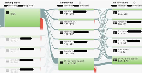
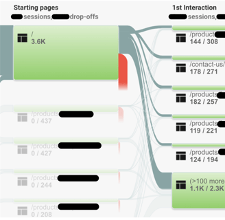
User Flow Analytics
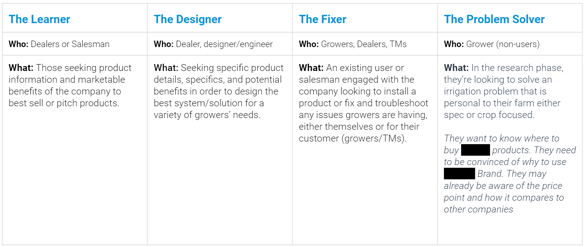
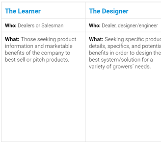
V1 Jobs To be Done
“People think of us for high-quality products and high-quality people, but not necessarily as a thought leader”
Impact:
Our fixes centered around these core concepts,
Supporting seamless wayfinding. Are you solving a problem or looking for information? --> There's a clear path forward.
Your content should do your brand justice! Tell your customers, "why buy us?" and let them see how warmly you cultivate a relationship with them.
Support users on both ends of the tech-savvy spectrum, specifically your international users.
This allowed us to show just how deep the impact of good design, knowledge, and communication with users could be. The cherry on top?
Our review of analytics a month after the new site launched indicated we had solved for a variety of issues, significantly increasing direct search traffic, improving wayfinding and reducing key product page drop-offs. We increased Organic search traffic by 87% and Monthly pageviews by 40% while decreasing Bounce Rates by 24%!
Get in touch! I'd love to hear from you
Thank you for finding your way here. Projects are all my work and made for my employers and clients, I hope you can treat this work with your utmost respect, professionalism, and discretion.
© 2025. All rights reserved.